Usability: When forward goes backward
Saturday, April 19, 2008
Usability: When forward goes backward
The IEEE Computer Society recently invited members to participate in a survey. Admittedly, since taking on my current job I have developed a strange desire for taking surveys to see what others are doing and what we could learn from them.
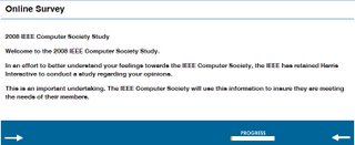
Besides being too long (read: I stopped answering the survey once I figured this would take me longer than I was willing to click through question after question) this particular survey had an interesting usability problem: For some reason, the forward link to move to the next question is on the left, whereas the backward link is on the right:

The designer may have considered reading order or attempted to make the site more accessible by putting the more frequently used option first, which would be commendable, but the result is a poor navigation scheme. I would be curious to know how many respondents get frustrated about this and abandon the survey.
Besides being too long (read: I stopped answering the survey once I figured this would take me longer than I was willing to click through question after question) this particular survey had an interesting usability problem: For some reason, the forward link to move to the next question is on the left, whereas the backward link is on the right:

The designer may have considered reading order or attempted to make the site more accessible by putting the more frequently used option first, which would be commendable, but the result is a poor navigation scheme. I would be curious to know how many respondents get frustrated about this and abandon the survey.
Labels: usability